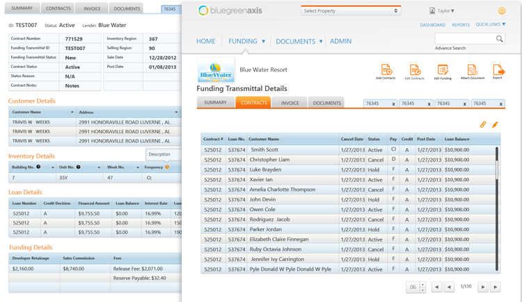
Challenge
Dissect existing application for flaws and bottlenecks and devise a solution which would simplify complicated data to allow users to open multiple member contracts in a single view to perform tasks efficiently.
My Role
As a UX designer, I was responsible for formulating the product vision, creating mock-ups, conducting beta tests, refining the product and fashioning the overall visual design while mentoring junior visual designers on the team.
Initial Research
To learn about the existing system, interviews were conducted with individual users about their experience of using the program and the problems they faced. Most users complained that they could not see details of their utility consumption. Many were unaware of existing problems in the user interface until they were shown presentations. A majority expressed the desire for additional guidance, consistency and clarity and time-saving initiatives to improve their experience. A session was also arranged with the stakeholders to leverage the user insights they already had to better understand bottlenecks in the current software.
Collaborating with a business analyst
To understand the time-share industry and decrypt its underlying rules and industry-specific terminologies at work in the application, a business analyst collaborated on the project.
Analyzing existing application to improve UX
User experience and pattern of using the application - based on modules of funding, invoices, contracts and documents – were observed and studied to learn how users used different functions of the application. They were asked detailed questions about the Interface problems they faced to trace the problem. The findings were divided into three categories:
- Information architecture
- Interaction
- Visual design
Problems in existing application
Our analysis found the following problems:
- Poor global navigation structure
- Incorrect screen selection for task actions
- Users had to revert to the home page every time they need to select a property
- Unnecessary complex interactions
- A Quick search was not available on all screens which forced users to go to other screens
- No indication for which property is currently selected in the workflow
- UserS did not get acknowledgment message at end of taskS
- Inconsistent design strategy
- Distracting fonts, color scheme, and headings
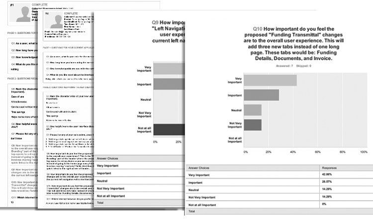
Survey to understand needs and behaviors
After interviewing users, a survey was conducted to help quantify concepts, validate some assumptions and get more insight into what the user wants and their habits while retaining optimal behavior.
Presenting the findings to the stakeholders
Sessions on future interface design were held where results of the user survey were shared with stakeholders and record input from them on the big picture and finalize strategic decisions to improve the product experience.
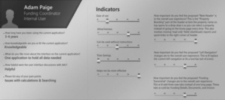
Personas
User personas were created which helped evaluate the application per specific user needs and address them in the redesign to provide a seamless user experience.
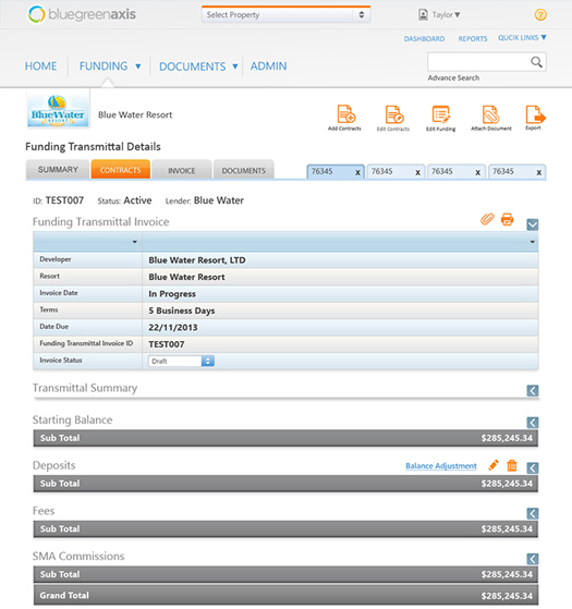
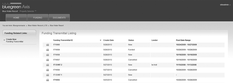
Information Architecture
The application information architecture was improved based on the findings by arranging the dashboard screens, reports, quick links and other screen elements in a more intuitive design. Existing Information architecture was tweaked per user feedback and observations. To fix interaction design, the major issue in the application, I sketched – like most aspects of the design process - some ideas to aid me when I worked on navigation.
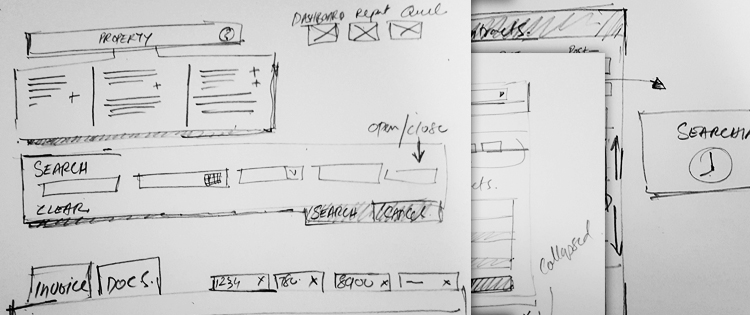
Ideation
UI interaction ideas were sketched – in team and solo sessions - for a set of undefined and some defined requirements. I then confided the ideas with the team sought feedback to strengthen the solution. The idea was then fleshed out with details, interface elements, content and structure.
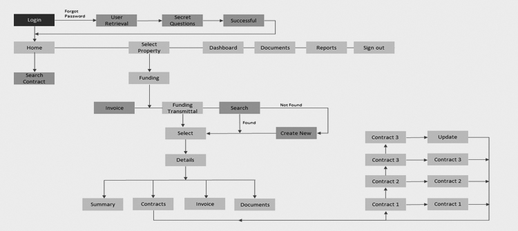
User flows
Bottlenecks in the process were highlighted in purple color to emphasize priority resolution during the redesign. I focused on solving issues that the users were facing in accomplishing important tasks and what design and information changes I could make which would give them the confidence to continue completing assignments.
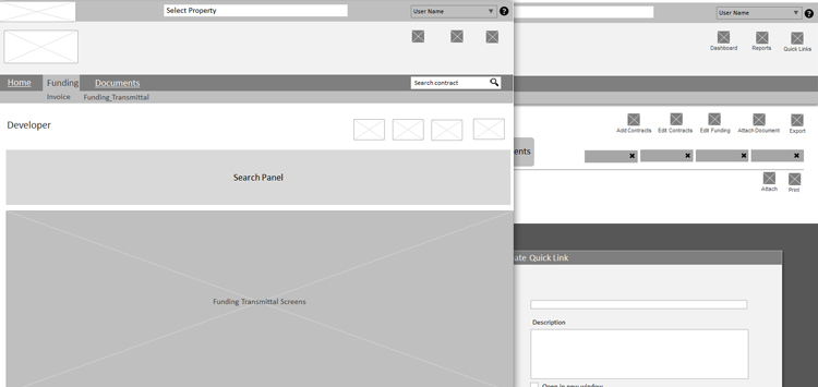
Low-fidelity wireframes
Low-fidelity wireframes were created representing the interaction design with details and functional requirements for every screen involved in the user flow. The design team worked to iterate and refine the designs and communicate them to the stakeholders and developers for reviews. The developers ensured that our wireframes and specifications met the requirements and were technically feasible.
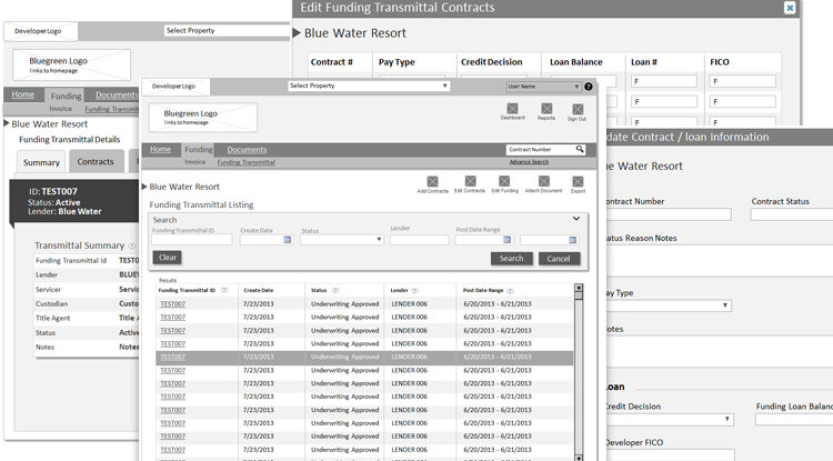
Interactive prototype axure
Axure was used to bring the abstract flows and interactions to life and get my ideas in front of the key decision makers.
Testing
Individual users were invited to sessions where they were monitored while they used the new interface of the application. They were asked feature-specific questions. The tests validated some assumptions and the design was iterated to validate them again. Users repeatedly remarked that the new interface felt very calming, achieving one of our major goals.
Visual design direction
I created the visual design of a few screens and my junior designers complete the rest of the screens while following my design direction. I organized collaborative sessions with the visual designers where I explained my philosophy of minimalistic design where I ask the question whether a design element adds any value for the customer or helps accomplish their task or do you include it simply because you like the way it looks. Allow the content to define the space, and use contrast and tension to help guide the eye.
Working with developers
The developers were brought on board at the wireframe building phase to exchange ideas and so that they can understand the reasoning behind the UX/UI design to make informed decisions in the development phase. My demo for the final product cleared many concepts for the developers of how the user interface works and helped solicit constructive feedback.
Result
Takeaways
The project taught me about the time-sharing industry and inventory management. It also proved a great exercise in designing applications with stringent constraints that it is not always about reinventing the wheel, rather using the existing wheel to move in a different direction.
The project also taught me about teamwork, that it was essential to maintain clear and empathetic lines of communication with all team members regardless of the fact if they are directly involved in your aspect of the project or not.