Challenge
Create user experience design of an ipad application for healthcare field workers. The application was designed to have a paperless entry system which automates the process of collecting care plan and assessment data.
My Role
As a UX architect, I was responsible for Prototyping, Usability Studies, Solution Refinement, and Visual Design. Also mentored junior visual designers.
Research
I met with product owners who already had enough information about their product vision. I had multiple sessions with stakeholders to understand product scope and target audience.
I clarified my vision about the product by asking questions, creating ppts, and brainstorming sessions with stakeholders. At first, my goal was to have some understanding of the product as product owners had. I simplified the information which is coming from all directions to have a clear picture of the product. The product team had already done a field study about the field workers and how they work in the field. They shared their findings which I used as my starting point towards creating a user experience. Their concept behind the app was to modernize the entire healthcare mobile case managers workflow, helping everyone get more done and saving data entry headaches.
Story Board
In order to make our product better, we must understand what’s going on in their worlds and how our product can make their lives better. And that’s where storyboards come in. It’s very much as thinking about your product as if it was a movie in term of how people would use it. It would help you to understand how people would flow through the interaction with it over time, giving you a clear sense of how to create a strong narrative.
Persona
I created personas of the patient, case manager, and their supervisors who were the users of the application. As a team, we wanted to focus on questions that gave us an idea of what case managers look for when they visit patients and complete forms. Personas helped us to understand our users, their goals and their frustrations. Having this persona provided guidance of knowing what problems we as a group was trying to solve.
User journey map
Once the team had a better understanding of our persona, I created a user story map. The main purpose of the journey map was to have a picture of how case managers perform day to day job with patients. User journey started when case manager receives a case from the healthcare agency then goes to the patient, ask multiple questions, fill multiple paper based forms, get them signed from the patient, fax paper forms to agency and wait for approval or other changes, etc.
I tried to put a true picture of how case managers are working and dealing with pain points and where are the opportunities to automate the process to save time and capture accurate data. It was interesting to see how case managers performing their task in old fashioned way in the time of the internet and fast portable devices.
Scenarios
I had a user journey map which was the average day(s) routine of case managers performing their tasks with patients, but there were situations when case managers had to do different things to accomplish their tasks. I had to consider those situations as scenarios so we could provide features in the app to coverall possible scenarios.
Brainstorm sessions to find application goals and features
We had another session of brainstorming comparing user journey, scenarios and over all scope of the project. We used the card sorting method to find user goals and features. Once we have goals and features ideas on the table then filter out features and goals based on project and technology feasibility.
- At this stage, we were able to define the scope of the application which will this workflow
- The Case manager with electronic forms visits patient
- Complete the form with the patient
- Sign and submit the form electronically
- Agency receives and approves form electronically
- Process completed and start a care plan
Features
Features were important for this application because if the right feature is not available in the application could cost them delays to complete forms and reschedule visit with the patient etc.
Even though, some features were very obvious to must have, but next steps of my user experience design were important to locate them.
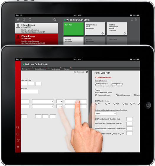
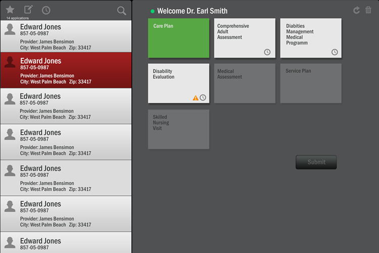
At this stage we had marked important features including user can save case informations and later complete it, incomplete forms and incomplete cases remind case managers to complete them, user able to see all forms opened side by side and chat feature, etc.
Information structure and sitemap
I created a screens map which was required in this app like login, search and add a patient, electronic forms for each patient, communication, etc. This application was simple in terms of the number of screens, but challenging in terms of completing a number of health related electronic forms, simple and intuitive interactions, helpful features based on context of the user goals
Ideation
Ideation helped me and our team generate a lot of different design ideas through which users can achieve more satisfactory solutions to their needs. I considered all the different ways that could possibly fix users' pain points, and then narrow it down to some practical, viable alternatives. I tried to do something new based on my observations and requirements.
All ideas are not created equal. No idea is too small or too wild that’s why I took my time and collaborated with the team to validate until the best solution is found.
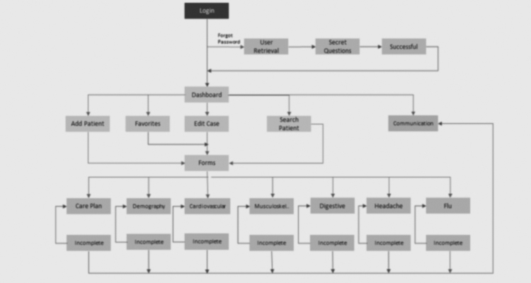
User flow diagram
With all the ideation sketches and whiteboard brainstorming, I created user flow showing case managers taking a set of steps towards a successful outcome and final action. The User flow which I created was a reflection of how the case manager will take steps towards goals and features helping them based on different scenarios.
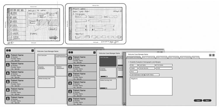
Low and high fidelity wireframes
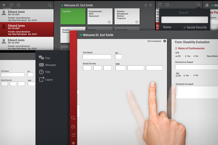
Now it was time to give the design a user interface wrapper. I created pencil sketches on wireframing paper templates and shared them with the team to improve till good enough to create high fidelity wireframe. Challenge was how to use the limited space of Ipad screen to show a number of forms opened same time with quick access to patient search, taking notes screen and help/chat section.
After few iterations of the ideas, I came up with solution to bring patient search and help/chat panel on the main screen from the edges of the screen based on windows 8 UX design where user can swipe at the edge of the screen to bring menu which is now very common in mobile phones when you swipe down from the top of the screen it brings phone settings menu on the screen.
Focus group
We performed focus group sessions with users from our persona demographics. In our focus groups we asked users about our concepts and showed them our initial prototype. The feedback was instrumental in our iteration.
Work with visual designers and developers
Productive collaboration is a key ingredient for a successful development and design team. To create a successful product, the entire team has to be on the same page and in sync. I found collaboration with developers daunting and exciting at the same time. I have some programming background that’s why I tried to speak the same “language” when we discuss concerns like performance, features, ideas, technology stacks, and so forth.
Developers and visual designers were expecting clarity, thoroughness, and a coherent vision from me. I put a lot of effort into coming up with good drawings, visuals and powerpoint presentations to communicate my ideas and direction because visuals are powerful and people tend to refer to pictures even if there’s a text with more details
Result
Takeaways
It was a very intresting project and it helped to get an insight of pain points when users working with technology in the field. It is totally different experience as compared to a user working indoor. Scope of the application was limited, but there were many features could be added to make field case managers life easier.