About the company
Interval International operates membership programs for vacationers and provides value-added services to its developer clients and homeowners' associations. The exchange network comprises more than 3,200 resorts in over 80 nations. Through offices in 14 countries, Interval offers high-quality products and benefits to resort clients and nearly 2 million families who are enrolled in various membership programs.
Background of the Interval International desktop website
Interval International set up their modernized website in the early 90s. Major upgrades were not introduced in the website's UX as it accommodates 2 million members. The Introduction of drastic changes in the website's UX should be carried out with vigilance. It was chosen to make advancements to developing projects rather than the UX of the entire website which was already structured upon various intricate products and projects, inattention to which could lead to consequences.
Redesign of the Accommodation certificate application
Interval International business team requested to redesign the user experience outlay of their accommodation certificate application which was developed many years back. This user experience design was created by developers as a software development process.
What is the Accommodation certificate?
An accommodation certificate is a commendatory bonus for the selected members of Interval International. A free week is given as a reward to the stipulated members. The reasons for the selection of these members and award certifications include; an early deposit in the week for an exchange. Consequently, these certifications result in healthier work relationships and revamped customer experience.
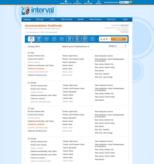
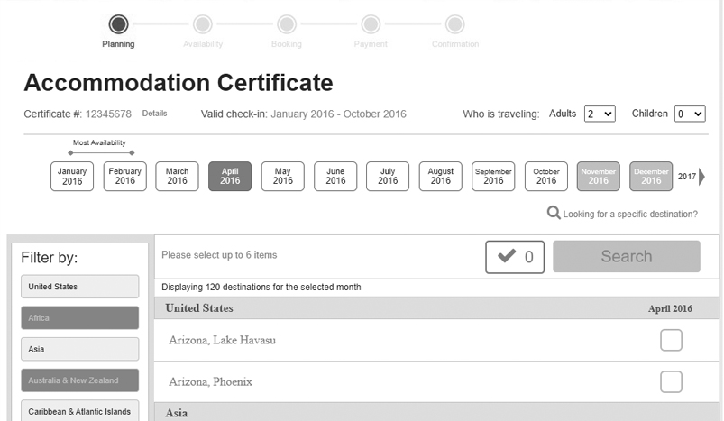
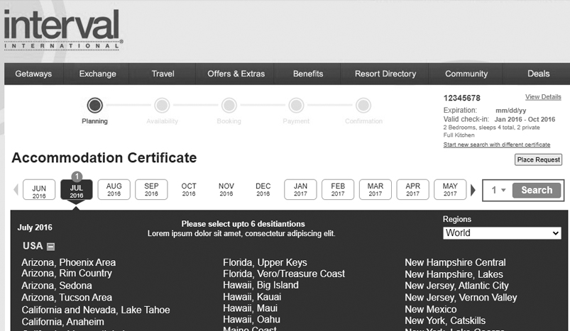
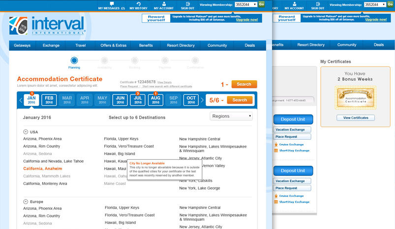
Global destinations are selected on the basis of resort availabilities and the time limit provided in lieu of the bestowed certificate. To benefit from a certificate, a member may select up to 6 locations in the eligible months travel criteria; for instance, a certificate awarded to the member allows booking a unit in a resort from the USA or Europe from January 2020 to June 2020 for a week.
My Role
I was a UX Architect, lacking foregoing information about the accommodation certificate application because it was created many years back even before I started working at Interval International. I was supposed to investigate, analyze, and create a better user experience in collaboration with the inventory management team, BAs, and technical teams as my accustomed set of responsibilities. I had to test my solutions with a focus group and present the final solution to the stakeholders.
Initial meetings with the business to understand the reason behind redesigning
I had my first meeting with the business and stakeholders during which we discussed the project and the reasons behind redesigning an application that had been part of the website for years. The business shared some of their data and research in which members were disappointed by the user experience design at that time and withdrew the workflow before completing it. Presently, users are engaging with much better user experience products due to which old accommodation certificate application does not meet their expectations.
Also, an accommodation certificate is free for selected members but it had a revenue stream attached to it. When a member wants to extend the expiry date of the certificate, they must pay a fee to extend the certification of expiry. Current user experiences disappointed members but also kept decreasing the revenue expected from these certificates.
Research and exposing UX issues of existing application
First, I analyzed the current user experience with major User Interface problems. At this stage, I had to collaborate with the business analyst to understand the business rules of the accommodation certificate. But I came to know that when accommodation certificate application was created years back, proper business rules were not documented. On an urgent basis, the projects, rules, and types of the certificate had been added to the application, over time without any proper documentation. Besides undocumented business rules, it had obvious user interface problems that needed to be addressed. I created a presentation based on my findings.
Research to understand how accommodation certificate program is working
Before beginning anything else, we had to go under the hood and find out the mechanism of the application and document it properly. Things like how the accommodation certification application worked from the admin setup till its utilization by members.
I met with inventory management team members who had been managing the accommodation certificate. They walked me through the process and answered my queries which helped me to understand the process and also form the user perspective. During the research, I came to know that certificates have different types which are distinguished by how many destinations are eligible while some certificates allow users to place requests to book a resort when resorts become available in the desired destination.
I had a very close collaboration with business analysts during this research because all the findings were important to be documented in business rules documents.
Identified and addressed an application architecture concern
I requested the accommodation certificate creation team member to create all types of certificates and make it available to me on the testing website so I can use each certificate type to find the inconsistencies and see how each certificate workflow works within the same website.
After testing different certificates, I found an interesting problem which I had to verify with the technical team. The user interface was showing the same number of available destinations even though those destinations were not assigned to the certificate from admins. After discussing and collaborating with the technical team, we discovered that at the time the application was created, a sample list of the destinations was shown to users and when a user selected a destination from the list, which is actually not part of the certificate, the system searched for the availability of the destination. This caused a sorry message to appear before the users, saying no resorts were available at this destination. It was taken as an immediate fix issue for the technical team and make a true destination list available based on a selected certificate instead of a sample list of destinations.
Inconsistent user interface based on a different type of the certificates
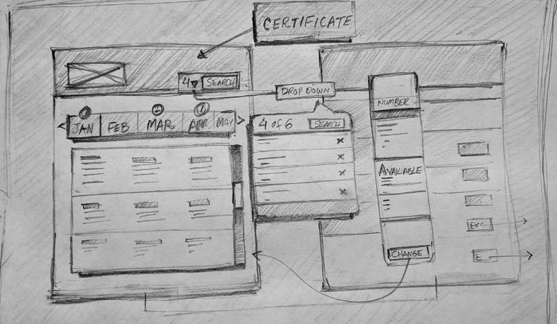
My research uncovered another user experience issue in which the user interface was different based on the certificate type. Members used to get certificates at different times and see different interface designs based on what type of certificate was rewarded to them. It made the user encounter inconsistency and leave the user in limbo about why the interface varied at different times. To solve this issue, I made rough pencil sketches to identify if there is a possibility to have a single type of user interface for each certificate type. I came up with a solid solution but still in a rough sketch, which could eventually be the final interface for all the certificate types.
Share my findings with business and other stakeholders
I compiled a presentation comprising screenshots and videos to show different user experience problems caused by the interface and backend structure of the application. This presentation was enough for the business to agree to create a new user experience with a contemporary approach. Moreover, it would align with the backend certificate generating system and provide an intuitive and simple user experience.
Interview a focus group to get their pain points
Enough information was already present on the table based on my research and collaboration with other team members. Despite this, I wanted to get more information so that I could fix the problem completely.
The current accommodation certificate was tested with the focus group. During the focus group session, we found an issue that we had missed. It was found that almost all users in the focus group did not know an accommodation certificate had been rewarded to them. It is a free week that any member would like to have and would be disappointed if they are not aware of it and get to know by visiting a certain page of the membership. Besides this single problem, remaining findings were similar as I had already identified in my research. I took my notes and saved recorded videos of the user journey to be used when information architecture and interaction design will be developed by me.
.
Personas
I created member personas based on my focus group sessions and frequently asked questions. Personas are important because they make clear and guide the developer for whom they are building the application.
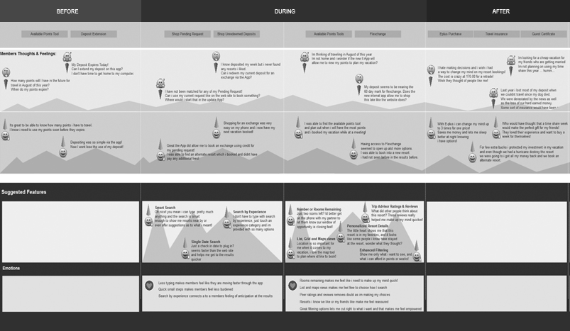
User journey map
I produced a user journey map based on the persona that I created. The user journey was developed initiating from the member login until the user books a resort using a certificate. I always slice the user journey into three phases “before, during, and after” because it helps me to create better information architecture.
Information architecture
I did not make information architecture from scratch but improved the existing one. I utilized my findings as guidance to improve the information architecture structure for example; a user must be notified on the home page or dashboard page about a new accommodation certificate if it has been awarded. I used my three phases of user journey map in which I saw the information that was needed or was helpful before, during, and after the user’s goal. It helped me to focus on information that was needed for the user before the user starts a user goal. Also which information is required and helpful information “during phase” and “after phase” of the user goal.
Ideation
My ideation always commences with paper, pencil, and a whiteboard. During ideation, I took out the sketches which I had drawn during finding an inconsistent user interface. I refined my sketches and also tried a couple of more options. Lastly, I shared them with my user designer team members to get their feedback as well. My Ideation was based on how to make a single and simple solution for each type of certificate that would help users to be well accustomed to one user interface instead of finding multiple UI each time.
User flows and scenarios
I developed the user flows and discrete scenarios through which the user can engage with an accommodation certificate. For instance, a user wants to utilize the certificate after expiration or wants to change the selected destination to search resort availability. Moreover, I collaborated with the business analyst to identify all such possible scenarios.
Interaction Flows
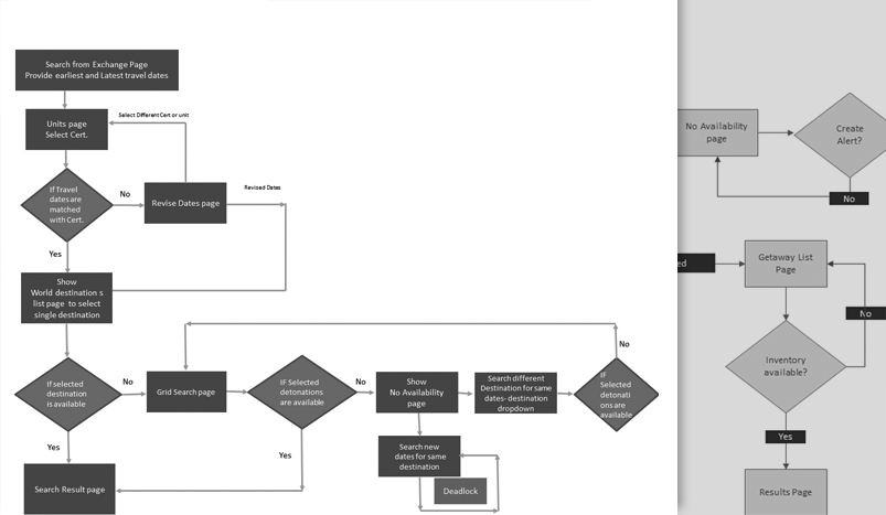
Once user flows and scenarios were identified, I worked on ideation of the interaction flows. My ideation sketches were supportive during the formulation of the interaction design map. I mapped in a diagram containing information, screens, and pages that would change user interaction in given scenarios. For me, the interaction flow diagram is the blueprint of the application because it shows user goals in accordance with related scenarios.
Iterative Low-fidelity wireframing and prototyping
I commenced on creating low fidelity wires without putting too much effort into the layout but focused primarily on information architecture and interactivity. The entire idea is to see the application from a user perspective at the minimum level or core of the user interface without adjourning it by unnecessary design elements. I made changes with quick iterations till a satisfying result was reached and then polished it further with proper layout and spacing details etc.
Usability testing of low-fidelity wires
I shared the full interactive wires with a focus group to see their response to my proposal. The process was video-recorded for the purpose of usability testing and to analyze it eventually within the UX team. Adjustments to wires came along during the usability testing in the form of minor changes.
Share with stakeholders
I presented the final porotype to stakeholders and focus group recorded videos to assist my user experience design solution. It was visible in the prototype that one style of user interface reduces the user learning curve of the application. The new user interface was easily understandable by the user without ambiguities as compared to the former design.
Visual design
I presented my solution to the visual designer and explained in detail the motivation behind all interface and how it helps the user from different perspectives. I made sure that the core user experience of the application further enhances in visual design layer.
Final testing of polished prototype with focus group
Ultimately, we put the prototype with actual visual design in front of the user group to see their behavior. The final product looked simple and helped the user to understand things like; where they are supposed to look to find the information or interaction based on where the user is in the user journey.
Working with developers
Technical lead and product lead were part of the uncut user experience design process because I kept them in the collaboration loop. I presented the interactive prototype to the development team and made sure that I answer all their questions that were related to the user experience. I always present my wires or prototypes in the presence of the business analyst to answer any business-related questions too. Moreover, I also provided the videos in which I showed the prototype and went through all the possible scenarios. These videos help developers a lot because whenever they forget something about the requirement, they can watch the video at their own pace to formulate a solution.
Takeaways
Each product or proposal in the application is essential despite this not being the main source of the company’s revenue. Sometimes such products or offerings are set aside by companies but users can still set their expectations with the company or company’s products based on their disagreeable experience.