Challenge
During our initial talks with clients, they expressed a strong need for billing app for the physicians which they can use to create bills because mobile devices can be held in a hand or stored in a pocket, allowing easy access and use at the point of care. Also, provide a seamless user experience which can help physicians to perform tasks of “bill to patient” activities with ease of use so they can concentrate on patient care.
My Role
As UX Designer formulate the product vision, creating mock-ups, conducting beta tests, refining the product and fashioning the overall visual design while mentoring junior designers on the team.
Research
The research was conducted to understand the challenge ahead and identify the workflow for the existing billing application. We interviewed actual physicians – the potential users - and inquired about billing requirements. During the interviews, we discovered various reasons which made the existing billing process ineffective. Moreover, the system could not keep track of pending bills, it was unclear about dues and due-dates, whether physicians were falling behind on their billings. There was no singular way where physicians could keep track of their patients’ bills based on medical exams/tests. One of the physicians helping staff walked me through the desktop application which physicians used at the end of the day or in free time to bill patients. I saw the demo of the application and took notes and asked questions about the application and process to completely understand the underline user experience and inefficient process.
Brainstorming with stakeholders
Involving stakeholders early on for their input and ideas in the project proved extremely advantageous since it helped us break down some concepts quicker than we had anticipated. We thoroughly understood their vision and contributed our ideas to define the scope of the app. I did quick iterations of the ideas as I did meetings with the stakeholders. My quick drawn visuals played a vital role during meetings with stakeholders because visuals are more understandable then just words coming from different directions. We refined our ideas and suggestions taking help with visuals on the projector.
Few physicians were participating through video calls that’s why people decided to share ideas verbally while looking my presented otherwise card sorting would have a been better choice. I wanted to work in collaboration and work around on which stakeholders were more comfortable. My goal was to get the best from these meetings instead of strictly following methods if stakeholders were reluctant to engage in an exercise when key stakeholders only available remotely through video chat.
Once all ideas were on the table, we separated realistic application goals from desirable features and by the end of it, our team had a clear picture of which user tasks will be included in the application. We had an in-house mobile application development team give their feedback as we discussed different ideas and possibilities. Collaboration with Mobile team was very helpful because they were able to share their IT limitations based on Mednax IT infrastructure. These included patient search, add patient, create a bill and complete incomplete bills. While some of the main functions were to identify billing status with some visual indicators, to make favorite of diagnosis codes, to prompt user with not billed and incomplete bills.
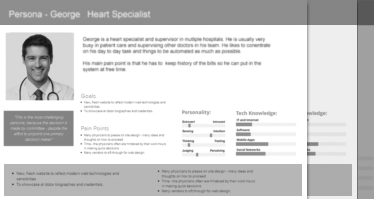
Personas
Personas were created to understand the expectations, concerns, and motivations of the users to satisfy their needs. I was keen to know more about
- Their favorite web resources and websites.
- The devices other than computer they use.
- Other commonly used apps.
- The elements of other apps and websites that they liked.
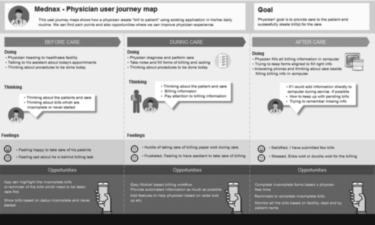
User journey map
User journey maps and other visual documents based on observations and user research is always helpful to understand the pain points and the opportunities for new applications. It is exciting yet challenging to create a user journey map, but it is essential to understand the problem and improvements. During analyzing the user journey map and interview sessions with the physicians I came to know that there is no feature or mechanism in the current process to let physicians remind them about the incomplete bills which need to be completed and send to patients to keep the company’s revenue up-to-date.
Information Architecture
I created an information architecture based on a user journey map in which it showed what user needs, potential opportunities and helpful features based on the different stages/phases of the journey. The core problem of the old application was to help physicians in reminding and keep tracking of the bills which were not either created or incomplete. As my usual UX method, I see things from the perspective of before, during and after phases. In Mednax mobile application “before” phase was very important because it is the stage/phase when physicians need different alerts/updates about new patients, bills to create and un-finished bills. Even though the “before” phase in physicians journey had many opportunities to improve but during and after phase had high potential to improve the productivity. For example, physician’s primary focus is patient care and it comes before anything else that’s why the “during phase” application should have a mechanism or feature to save the information if left in middle without saving. Information architecture design was looking very promising because it was addressing pain points which became very clear after research and using proven UX methods.
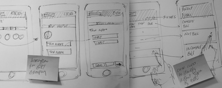
Ideation and sketching
With the information architecture in hand, I started illustrating on my sketchbook that proved invaluable throughout this project. Quick revisions on the sketchbook enabled me to get instant feedback from my team members and to make the changes rapidly.
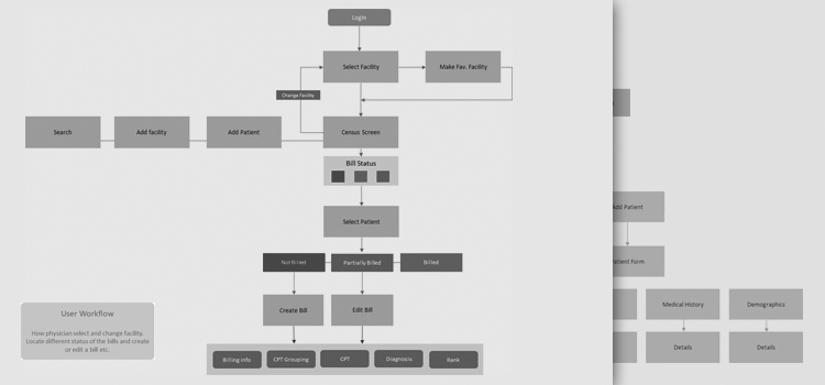
User Flows
With all the information about user-flows identifying each user-type and user-objective, I created the main user-flow that fits all of them. It was based on two elements
- The user and user objectives that needed be to accomplish
- The user entry points needed to accomplish these goals
After the team agreed to a set of workflows, I created a document as a driving tool for subsequent steps.
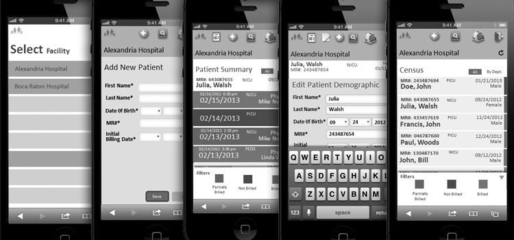
Low fidelity wires
Sketching and creating wireframes with minimal details of all the scenarios and flows to a place the interactions felt intuitive and cohesive. This helped me see my ideas come to life, explore possibilities and evaluate them with stakeholders and users. My focus was to capture the best information architecture and interaction pattern instead of adding UI design details which is important but should come later.
Personalization
Once low fidelity wires refined after multiple iterations towards accuracy then I paid attention to the details to make it more personalized experience to increase the adaptability of the product by looking into the data available that would help to make the app a more personalized experience for the customer. Details from the available data helped me identify these questions:
- Who signed in and how do we know?
- Would this experience be better in the language spoken by the physician himself?
- Are we asking the physician to provide the information we already have?
- Can we save the physician time and effort by pre-populating forms with known information?
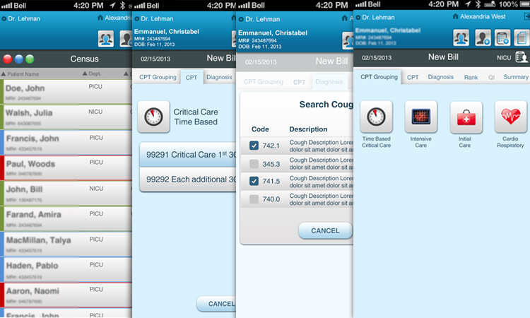
High fidelity wires
Taking guidance from low-fidelity wires I created high fidelity wires with enough details to present to stakeholders and focus group users. At this stage, my focus was interaction to convert the application which has all the user goals but requires clear and intuitive interaction to transform the application into more clear and intuitive product.
One-on-one usability testing
We ran usability tests with our key persona types, mostly observing and occasionally asking questions. It helped us find where users got stuck and a lot about improvements were needed with data visualization, general structure, and product navigation.
Visual designers
Heavier features need to justify their weight with, particularly compelling functionality as it consumes more mobile data costing the user more money. Keeping that in mind I designed a few screens and handed them over to junior designers to complete the rest of the screens under my directions.
Work with developers
Application architect and leading developers were already engaged from the start of the project to raise concerns or guide in terms of technology to keep the application realistic. In a cross-collaborative environment, my prototype and interaction showed developers how something should work in the most straightforward way possible. I provided developers with clean, well-organized information to ensure that the finished product is exactly what we visualized as a team. I was open and available to developers for any questions and information.
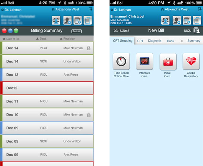
Result
Take away
I learned tremendously from this project. One of the most important lessons I learned was to design in the presence of multiple constraints. To uncover the complexity of the system and to identify the constraints was a daunting, yet important task.
Secondly, I learned about team collaboration and its importance. Solving a problem from extremely different viewpoints can often yield amazing results. However, it can be stressful. Valuing the time and opinion of team members and doctors’ adoption of the product played a crucial role in the success of the product.